

Navigation & Recommendations
Project Overview
This project aims to develop a responsive web app designed to enhance trip planning by combining transportation options with business reviews. A to B will allow users to seamlessly explore new places, find activities, and plan their routes—all in one app. Many travelers and commuters face the challenge of having to switch between multiple apps to plan their trips, making the process time-consuming and inefficient. A to B solves this by consolidating all the necessary tools into one platform. I’ll focus on both the UX and UI phases to create a design that prioritizes intuitive navigation and ease of use. This process involves developing innovative features and visual designs that align with users’ needs, making the trip planning experience more efficient and enjoyable.

A to B Navigation
Who
A to B is designed for travelers, commuters, and anyone looking for efficient trip planning. It's for those who want to streamline their travel experience by easily finding transportation options and discovering places to visit—all in one app.
What
A to B is a navigation app that combines transportation options with business reviews, allowing users to plan their trips while exploring new places. It enables users to find the best routes, add stops to their plans, and discover what’s around them—making their travel experience more convenient and enjoyable.
Where
The app is accessible from anywhere and can be used to plan trips locally or internationally, all through your mobile device. Whether you’re traveling across town or exploring new cities, A to B offers the tools you need for smarter, more efficient travel.
Why
The goal of A to B is to make trip planning easier by consolidating everything you need in one place. By providing transportation options and business reviews together, it removes the hassle of searching through multiple apps, giving users a seamless experience when planning their journeys.
Design Timeline

Research & User-Centered Design

To create an intuitive and effective trip-planning experience, I conducted research focusing on competitive analysis, user personas, and user flows. Each step helped shape the design and functionality of A to B, ensuring it meets the needs of travelers and other users.
The competitive analysis involved evaluating existing navigation and travel apps to identify strengths, weaknesses, and gaps in the market. This research highlighted opportunities for A to B to stand out by seamlessly integrating transportation options with business reviews, offering a more comprehensive planning experience.
Developing user personas was crucial in understanding the behaviors and needs of potential users. By identifying different types of travelers and planners, I was able to design features that align with their expectations, ensuring the app is both functional and user-friendly.
Finally, mapping out user flows allowed me to refine how users navigate the app, from discovering new places to finalizing their plans. A well-structured flow ensures that trip planning is smooth, intuitive, and efficient, reducing friction and enhancing the overall experience.
By combining these research methods, I was able to create a product that prioritizes usability while standing out in the travel and navigation space.
Competitive Analysis

User Personas


User Flow

Moodboard & Inspiration
The design of A to B draws inspiration from bold contrasts and modern aesthetics, reflected through the white, black, and purple color scheme and bold sans-serif typography. These elements were chosen to create a dynamic yet clean look that enhances readability and evokes sophistication. The moodboards helped shape the overall visual direction, ensuring that the colors and typography work together to create a cohesive, modern design that aligns with the app’s user-centered experience.


Medium Fidelity Wireframes
After establishing the core design elements, I created medium fidelity wireframes to start visualizing the layout and functionality of the app. At this stage, I focused on the structure of key screens, such as navigation, content placement, and interactive components, without getting into visual details. This allowed me to test the usability of the interface and refine the user flow, ensuring each feature was easy to find and use. The wireframes were intentionally simple, providing a clear overview of the app’s layout and how users would interact with it.
The medium fidelity wireframes served as a critical step before moving on to high-fidelity mockups. They helped to identify any potential usability issues and provided a solid foundation for further refining the design. By mapping out the user journey and testing different interactions, I was able to ensure that the app would be intuitive and meet the needs of the users before investing time into more detailed visuals and design elements.


High Fidelity Wireframes
With the structure and functionality in place, I moved on to high fidelity wireframes, where the app really started to take shape. This stage was all about adding in the details—colors, typography, and interactive elements—while making sure everything looked polished and felt intuitive to use. My goal was to create a clean, modern interface that balanced aesthetics with usability, making navigation smooth and effortless.
The biggest challenge I faced during this stage was adjusting my final wireframes to work with the necessary content. The layout from my medium fidelity wireframes didn’t quite align with the content as I had originally planned, so I needed to make several adjustments to ensure a better user experience. I refined the design to accommodate the content more effectively, improving the visual hierarchy and usability. These changes not only helped make the app look great but also ensured that A to B functioned as intended on mobile devices, providing a seamless experience for users.


Style Guide
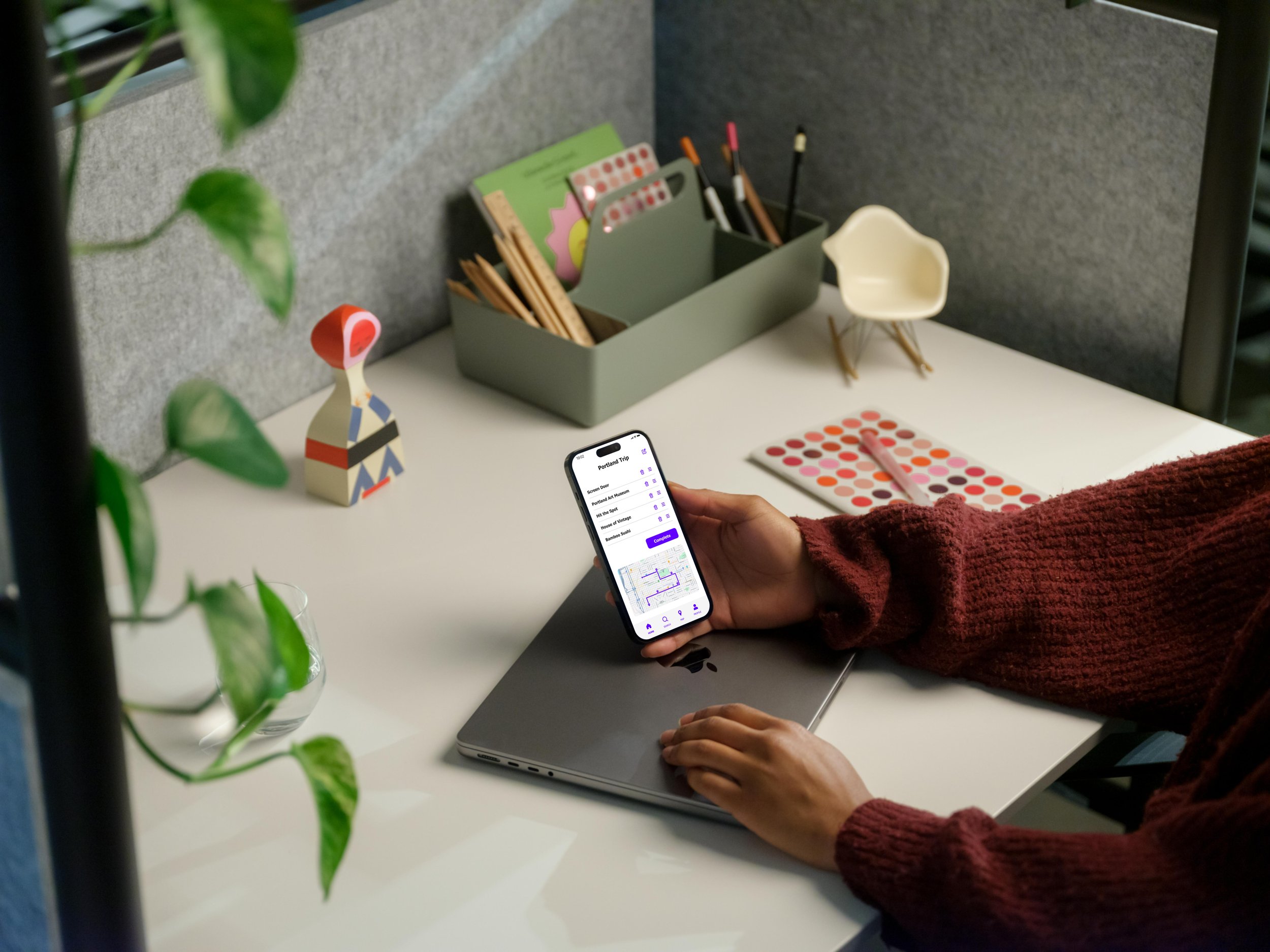
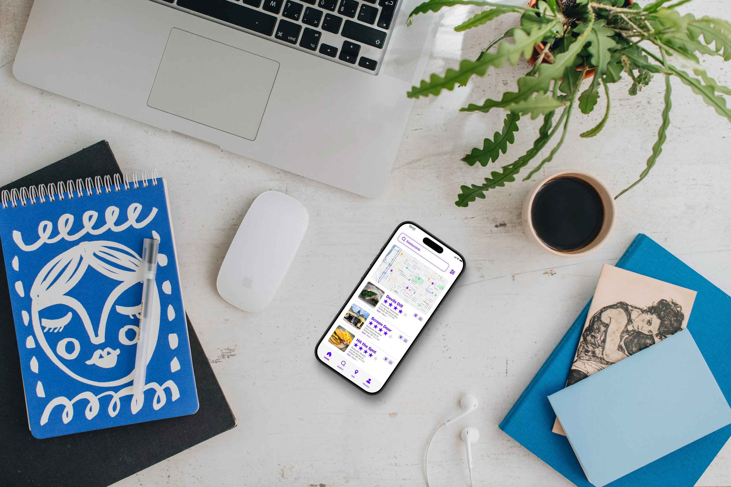
Mockups

Solution
A to B is a responsive web app designed to simplify trip planning by combining transportation options with business reviews. It allows users to explore new places, find activities, and plan their routes all in one app. To ensure the app met users' needs, extensive user research was conducted, including user personas and competitive analysis, which helped shape the app’s design and features. The goal was to create a seamless experience by consolidating essential tools into a single platform, making travel planning more efficient and enjoyable. Throughout the process, I focused on both UX and UI design, refining the app’s layout and features to ensure intuitive navigation and a clean, modern interface. The branding was carefully crafted to reflect the app’s purpose—simple, efficient, and user-friendly. With a focus on user needs, A to B aims to provide an easy-to-use, engaging solution for travelers and commuters.